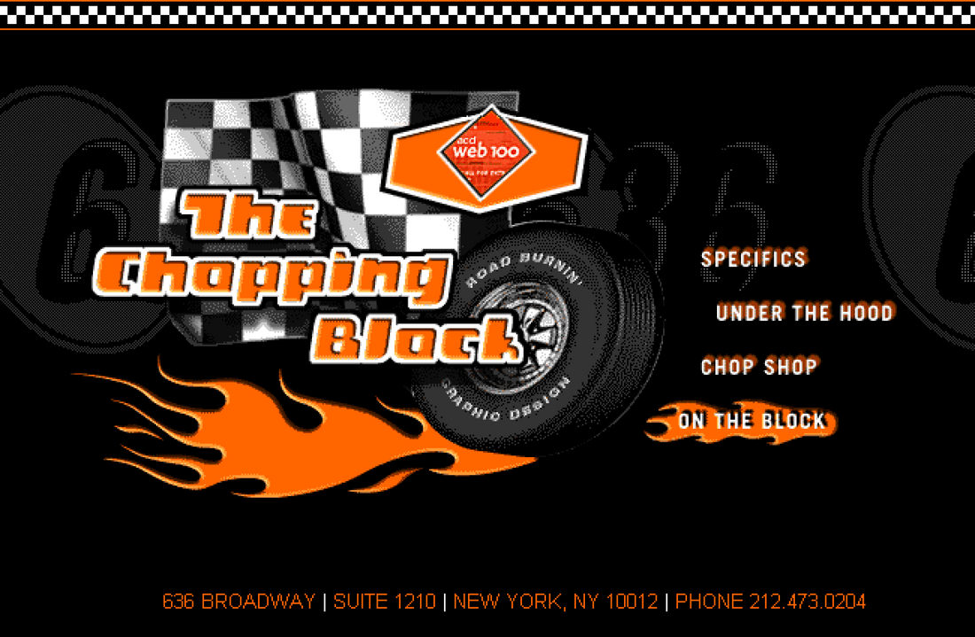
Chopping Block Nascar Site (July 1997)
The first official Chopping Block website was uploaded slowly via modem around January of 1998. Home page shown above. Unlike MOST things on the web, this site still exists largely intact 25 years later.
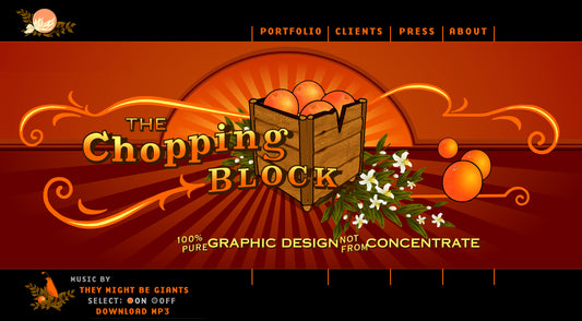
We wanted to brand our website as if we had a brand identity crisis. This concept was chosen because we couldn't decide on a specific design aesthetic for Chopping Block as a design studio. So, we decided to temporarily adopt different identities, starting with NASCAR drivers. We then continued to rebrand ourselves as B-horror movie actors, astronauts, Boy Scouts, and ultimately as orange farmers.
That’s me in the middle of that nerd pile-up and that is my fake driver trading card below.
When considering this concept, it is important to note that during this time, many websites were characterized by the prominent use of beveled buttons, pages full of HTML text links, and worst of all… adopting a futuristic cyber style. One client even criticized our web design for resembling print design more than a typical website. However, this was precisely the intention of our branding strategy.
One aspect that really dates these graphics is the low-resolution bitmapping, a result of the limited technology at the time when sites were designed for a maximum resolution of 800x600 pixels. Today's standards would consider this resolution almost as a thumbnail size. To give some other perspective on the technology available during that time, our use of image-based roll-overs on the main navigation was considered ground-breaking, especially the way it was seamlessly integrated into the overall illustration.
No comments



0 comments